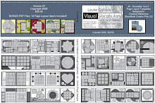
Kerri designed this totally cute page using a page layout template from my Volume #3 CD. This template is deceiving because it appears to be one large photo opening. However, as you can see below, it is actually a fun patchwork full of photo openings! I love how Kerri changed it up a bit and made it her own. Thank you Kerri!
Before
After

No comments:
Post a Comment